Topic Updated: April 01, 2025
Grid User Interface
Components within Humanify Portal display data within grids. Grids contain many functions that help you easily search, sort, view, and manage the data in Portal and each of it's components. In this topic, some of the most common grid functions are highlighted to help you get the most out of Portal.
Grid Menu
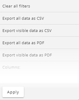
Each of the grids found throughout Portal have a Menu Icon located on the top-left side. This menu allows you to perform tasks that are specific to the type of grid you are viewing, as well as common functions that are available on all grids.
| Menu Icon | Selecting this icon reveals a drop-down menu with specific grid tasks as well as common tasks, such as:
|
Grid Pagination
This section of the grid shows the total number of data records displayed and available to display on the grid. It also provides controls that allow you to navigate through the pages of data within the grid.
Grid Filters
Grid filters allow you to apply filters to all the data displayed on a grid. Some filters are unique and specific to a grid, but many are commonly found on several grids. Below are some of the common grid filters found throughout Portal.
Grid Column Headers
Grids within Portal have many sorting and search filter features that help you find and select data quickly and efficiently.
 / /  | Select / Deselect All | Displays above grid data and to the left of the column headers. Use this selection indicator to select or deselect all data displayed within the grid. |
| Pin Column | Used to pin a column. Pinned columns stay in view when scrolling horizontally to view grid data. | |
| Unpin Column | Unpin a column. | |
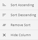
| Column Options Icon | Reveals a drop-menu with the following options:
| |
| Sort Ascending Icon | This icon displays next to a column header where the data is sorted by ascending. The number next to the icon represents the sort order, if multiple columns within the grid are sorted. Note: You can also click on the column headers to toggle between the sorting methods. | |
| Sort Descending Icon | This icon displays next to a column header where the data is sorted by descending. The number next to the icon represents the sort order, if multiple columns within the grid are sorted. Note: You can also click on the column headers to toggle between the sorting methods. | |
 | Search Filter | Each column on a grid has a search filter. Enter text into any column's search filter to find a specific result within that column. Narrow search results even further by entering text into the search filter of other columns. |
| Clear Filter | Clear a filter by clicking icon that displays on the right-side of the search filter. | |
 | Drop-menu Filter | Some columns have a drop-down menu filter instead of a search field. The displayed column data filters based on the selection. |
Select / Deselect Grid Data
Selecting data on a grid allows you to export specific data (see Export and View Grid Data) or apply settings or changes to multiple selected items.
NOTE:
When grid data is selected, the Grid Menu may display different options for the selected data.
Column Positioning
You can change the position of a column within a grid by dragging and dropping the column header to the position you want it to display. Place your mouse cursor over the column you want to move, left-click and hold the button down, and then drag and drop it in the position you want it placed.
See Also
Please let us know how we can improve this topic by clicking the link below:


